UIKit Continued - Custom View and App Life Cycle
Michael Lin
Table of Contents
Custom View
Right now you are probably familiar with customizing your UI through tinkering the properties of some build-in elements. Custom views take it one step further by subclassing and composing one or more views together into a new component. It enables you to encapsulate a complex view hierarchy into a single view object, improving code reusability and readability.
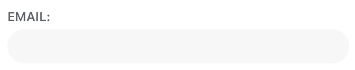
Above is a custom view that was implemented in the Project 3 starter code, it includes a UILabel and a UITextField for user input. We can instantiate such view through its custom initializer.
AuthTextField(title: "Email:")
Custom views unlock a whole bunch of ways to customize our UI, and it’s used in almost every real world iOS project. But before we can dive into how to create them, we will need to learn a few new auto layout concepts.
Constraint Priority
Every constraint is associated with a priority. By default, the constraints you create have the maximum priority required.
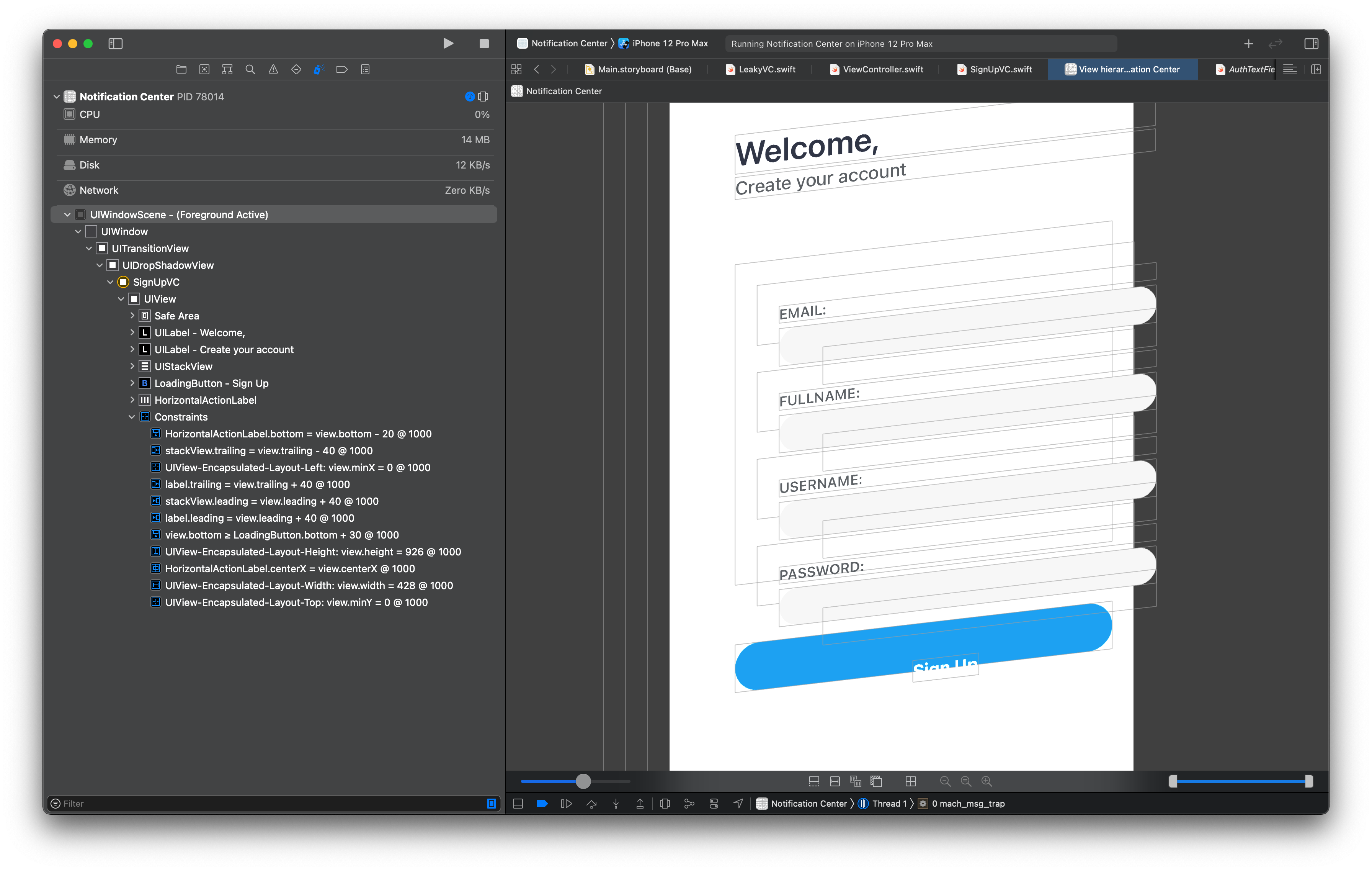
Notice the @1000 at the end of each constraint on the left. It is the raw value of the priority of that constraint, which is a Float ranging from 0 to 1000. Constraints with a priority of 1000 are the ones that are required. Anything below 1000 means the constraint is optional.
This is also why constraint conflicts occur: it happens when auto layout cannot satisfy all the required constraints simultaneously. Conversely, for constraints with less than required priority level, it can break without triggering a conflict. Between contraints with non-required priority, the one with lower priority will be dropped first.
Optional constraints are a powerful tool for creating flexible UI. One thing I always like to do is to think of them as springs. They will push or pull the UI towards their defined length or position, and will give way to other constraints with higher priority, which allows you to specify the order of which different parts of the UI extend or compress.
To set the priority of a constraint, use the priority variable defined under NSLayoutConstraint
bottomInsetConstraint.priority = .init(rawValue: 700)
Although you can manually create a priority using its initializer and raw value, more often we will choose from one of the predefined values such as .defaultHigh (rawValue = 750). This gives us some consistency which setting up constraint priorities.
bottomInsetConstraint.priority = .defaultHigh
Intrinsic Content Size
So far you might have discovered that not always do we have to set constraints on the size of a view.
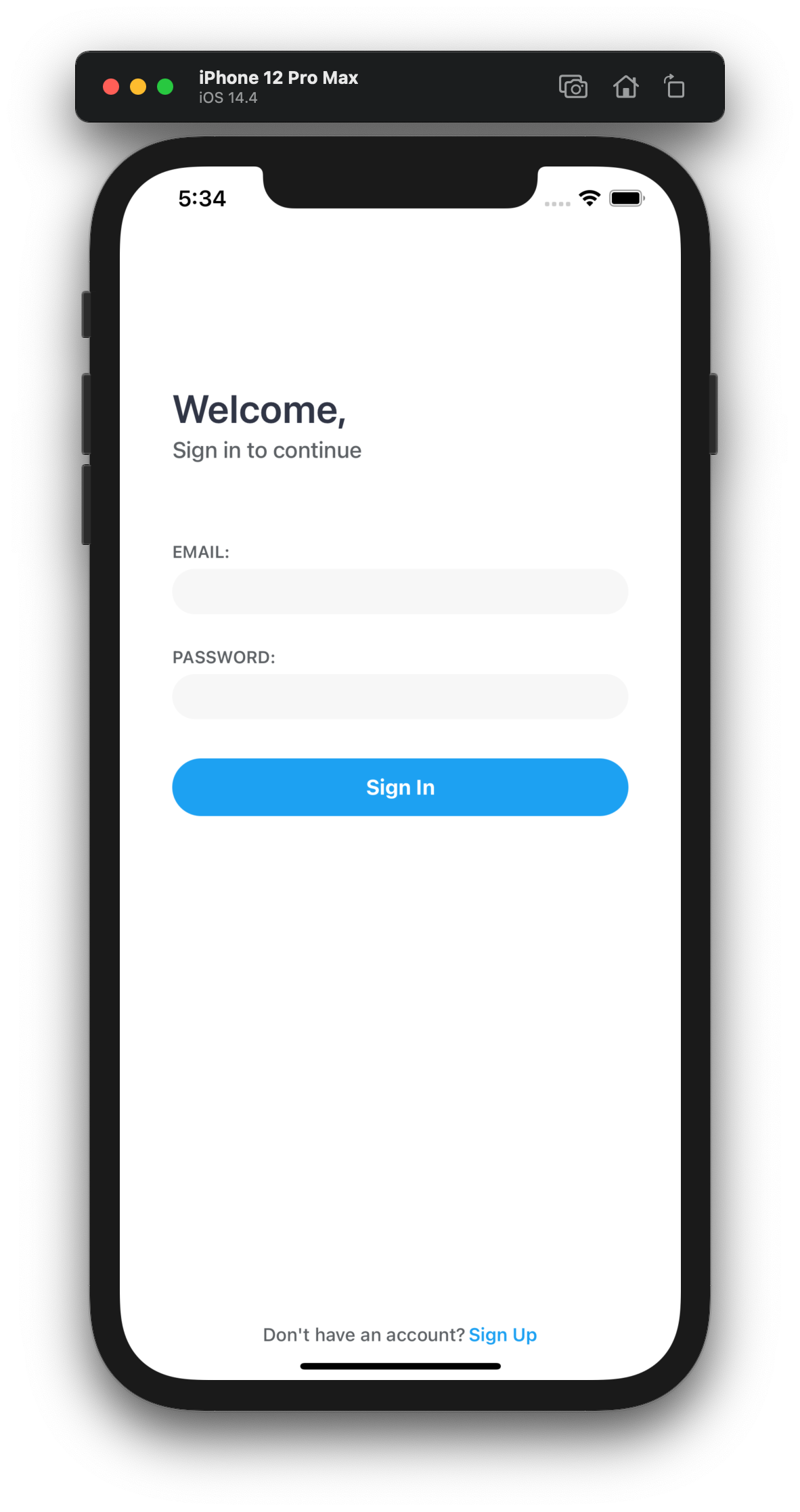
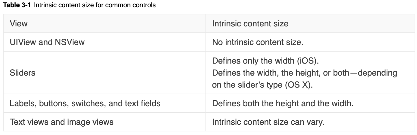
For example, in the Project 3 starter code, we didn’t define the height of any of the controls. Yet the views still automatically extend to fit their content. This is because certain views such as labels and buttons have a natural size which can be inferred from their content and attributes. This is referred to as intrinsic content size. It tells auto layout what is its preferred size based on the current content. For example, a button’s preferred size is the size of its title plus a small padding on each side.
You can override the default computation of a view’s intrinsic content size if you want
override var intrinsicContentSize: CGSize {
    // Calculate w and h
    return CGSize(width: w, height: h)
}
Then call invalidateIntrinsicContentSize() whenever something changes that affects the intrinsic content size. The method will notify Auto Layout to recalculate the frame based on the new content size.
Content Hugging and Compression Resistance
Behind the scene, intrinsic content size is translated into two pairs of optional inequality constraints known as content hugging and compression resistance constraints.
view.height >= intrinsicContentSize.height @750
view.width >= intrinsicContentSize.width @750

view.height <= intrinsicContentSize.height @250
view.width <= intrinsicContentSize.width @250
Both the compression resistance constraints have priority defaultHigh at 750, whereas the two content hugging constraints have priority defaultLow at 250. Intuitively, this means that it’s easier to stretch a view than it is to shrink it, which is what you want most of the time.
You can set the priority of any of the four constraints using the setContentCompressionResistancePriority(_:for:) and setContentHuggingPriority(_:for:) methods. For example
view.setContentHuggingPriority(.init(rawValue: 249), for: .vertical)
This sets the view’s content hugging priority to be slightly lower than that of the others’. So when auto layout solve for the constraint system, this view will be the first to expand.
Understanding these concepts can help you leverage the layout process and is crucial to creating a highly robust and reusable views.
Creating a Custom View
Custom views are created through subclassing an existing view. It could be any known UIView subclass such as the build-in controls like UILabel or UIButton, container views UIStackView, or even another custom view you defined. We will use the AuthTextField from MP3 starter as our example.
final class AuthTextField: UIView { ... }

AuthTextField(title: "Email:")
App’s Life Cycle
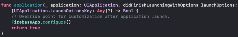
In this section we will bring our attention to the two files that we’ve been kind of ignoring so far: AppDelegate and SceneDelegate. These are the files that are responsible for responding to the transition events between states of the app, known as life cycles.
At a high level, their job is to inform you of any transitions between states of the app so that you can perform some sort of life cycle task. One common use case is for saving the app’s state beforing entering the background.

Background
Before iOS 12, each app can only have one instance running on foreground at any given time. So UIKit delivers all life-cycle events to the UIApplicationDelegate object in AppDelegate.swift. It works with UIApplication and you can think of it as the “root” of the App. Previously, the app delegate would have access to a UIWindow object where the app’s root view controller will reside. But on iOS 12 Apple added a new feature that allows multiple instances of your app’s UI to run simultaneously.
This means that an app may have to manage more than one life cycles and windows at the same time, which is why after iOS 12, we have a new concept called scene. A scene manages an instance of your app’s UI and its life cycle just as the app delegate did before. In other words, We still only have one “app”, but now we can run multiple “scenes” under the same app.
Using Life Cycle Methods
Despite the convoluted system of app delegate and scenes, using their life cycle methods is pretty straightforward. Just put the code that you want to execute in the corresponding life cycle methods, and it will be triggered when the corresponding events occur. One of the methods that you might’ve seen being used is scene(_:willConnectTo:options:). We implemented a simple check in MP3 to see if an user has already logged in.
class SceneDelegate: UIResponder, UIWindowSceneDelegates {

    var window: UIWindow?

    func scene(_ scene: UIScene, willConnectTo session: UISceneSession, options connectionOptions: UIScene.ConnectionOptions) {

        guard let windowScene = (scene as? UIWindowScene) else { return }
        window = UIWindow(frame: UIScreen.main.bounds)
        window?.windowScene = windowScene
        if FIRAuthProvider.shared.isSignedIn() {
            let vc = UIStoryboard(name: "Main", bundle: nil).instantiateInitialViewController()
            window?.rootViewController = vc
        } else {
            let vc = UIStoryboard(name: "Auth", bundle: nil).instantiateInitialViewController()
            window?.rootViewController = vc
        }
        window?.makeKeyAndVisible()
    }

    /* ... */
}